Philboss Design Copyright 2026

Aussie Tom’s Tours

Branding that embodies exploration

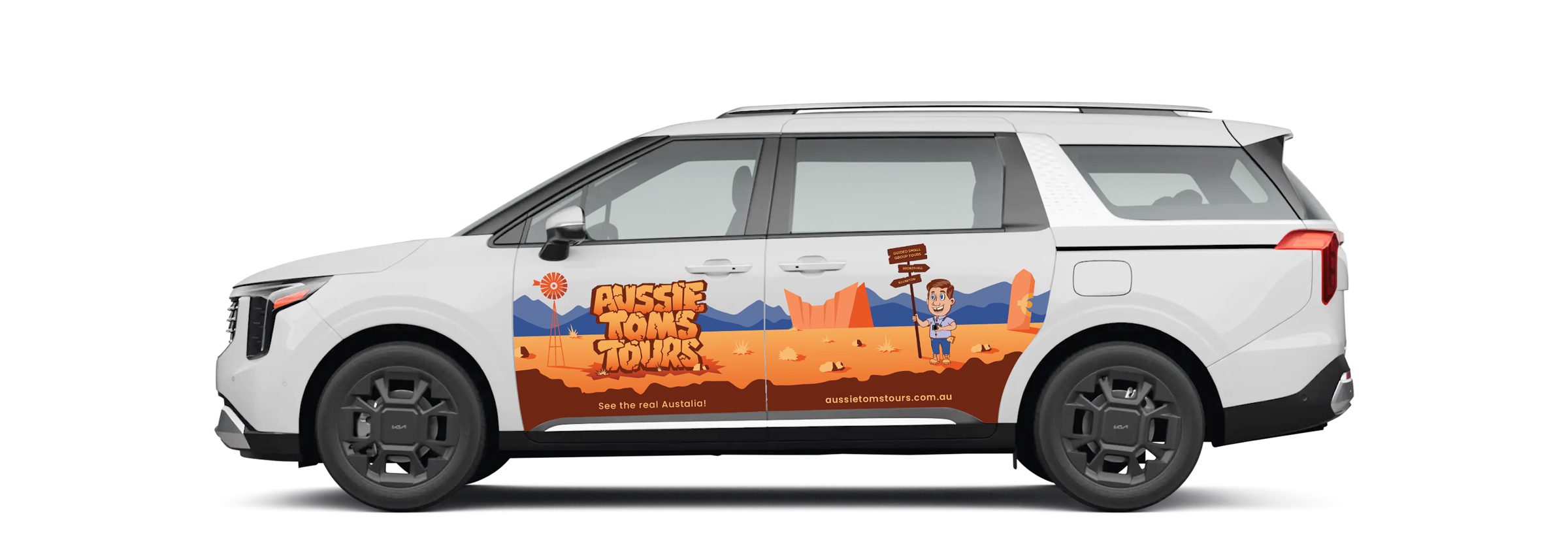
To bring the identity to life, we created a mascot inspired by Tom, the tour operator himself. His unique characteristics were carefully observed and translated into a playful, illustrative character that served as the face of the brand.

Continuing the illustrative direction, we introduced a hand-drawn signboard featuring the tour locations and the tagline “Guided Small Group Tours”. We also crafted a custom type style for the text-based logo element, inspired by stacked rock boulders as a nod to Broken Hill’s rugged terrain.

To wrap up the creative, we developed a custom landscape illustration for use across a range of brand applications. Inspired by Broken Hill’s attractions, we added illustrative elements that highlighted the region and created a flexible backdrop for the overall identity.

Logo Design for Tom's Aussie Tours

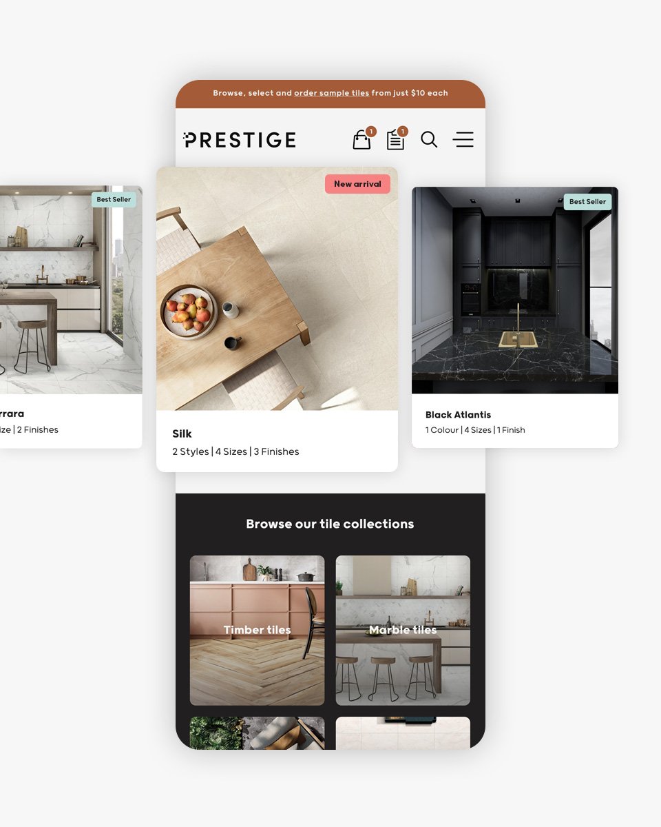
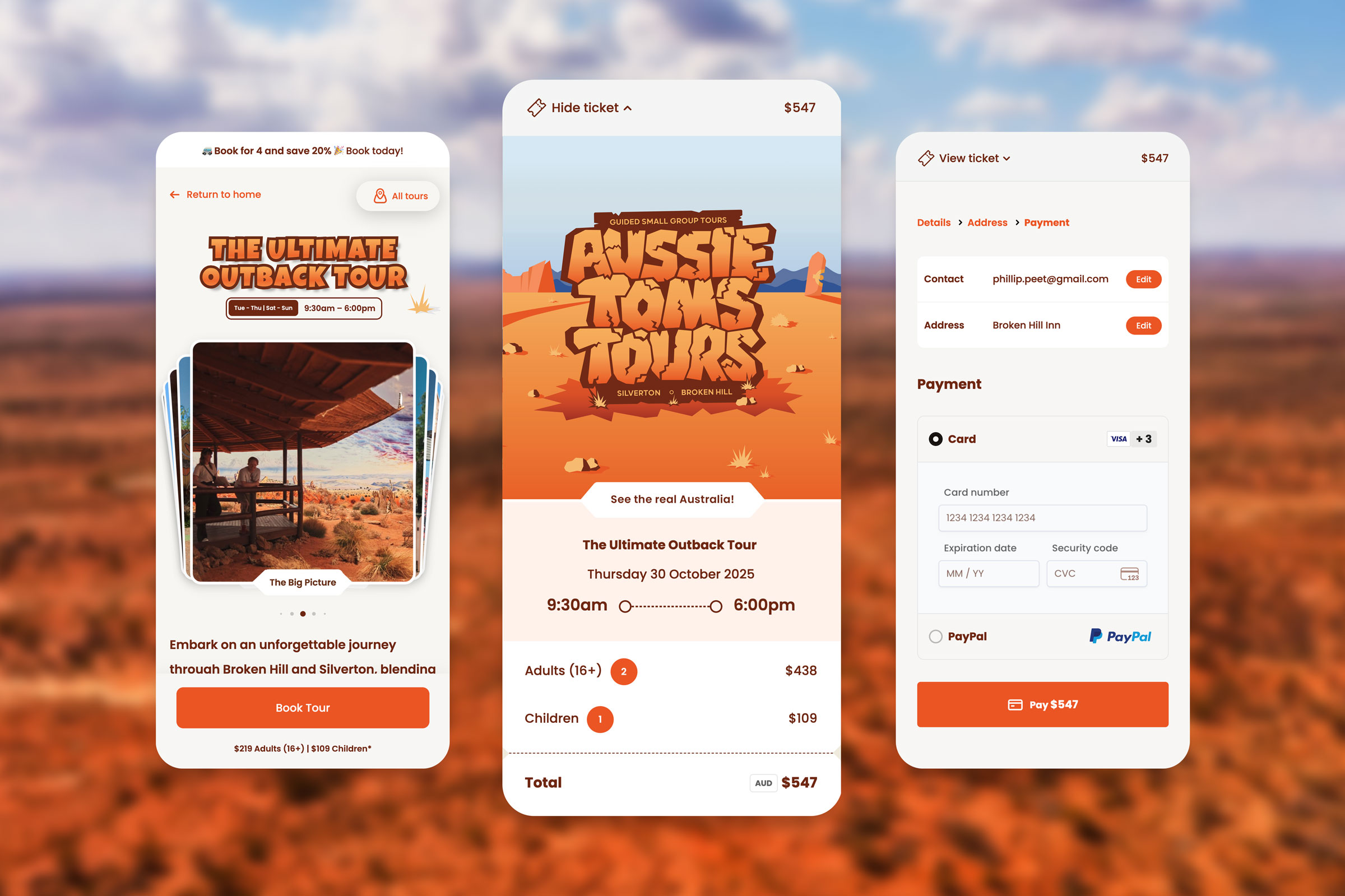
A digital gateway to the outback

We designed the website as a responsive storytelling journey that captures the spirit of adventure. Rich visual content, illustrations, and curated itineraries immerse users from the moment they arrive, guiding them through each tour in a way that feels authentic and inviting.

This immersive approach extends through to the checkout experience, where a simplified, streamlined process makes booking tours effortless. Every touchpoint was crafted to feel consistent and engaging β€” from the first scroll to the final confirmation β€” creating a cohesive digital experience that embodies the spirit of exploration and invites users to discover, plan, and book with ease.

Aussie Tom's Tours Demo
Thomas Peet, Aussie Tom’s Tours

“Phil, it looks amazing and I think this is going to be huge. I’m really happy with how easy everything is to manage β€” and the feedback since launch has been incredible.”

Visit the Website

Prestige Tiles & Co.

Branding

Looking to create a distinctive edge in a competitive marketplace, we reimagined the Prestige Tiles & Co. brand. We set out to create a simple, modern, and versatile identity.

We produced a comprehensive style guide to showcase the full application of the brand. The document defined logo variants, colour palettes, font collections, signage, digital, print, and social media application.

User experience

A major focus in the evolution of Prestige Tiles & Co. was to create an immersive end-to-end digital platform. One that provided the same level of satisfaction on desktop and mobile devices.

Working closely with my client, we clustered and showcased products in several ways for users to browse. We incorporated all the necessary tile information in single-touch UI elements – style, size, and finish. From this point, one can easily request a sample or quote based on their selection.

Elias Sleiman, Prestige Tiles & Co.

“The brand redesign and website upgrade have transformed the way we connect with our customers. Our new modern, minimal, and versatile identity truly reflects the quality and sophistication of our tiles. The upgraded website offers a seamless experience, making it easier than ever for our clients to explore our collections and find inspiration for their projects.”

Visit the Website

Prestige Tiles & Co. Website in Tablet

Align Recruiting Solutions

Kate Flippence, Align Recruiting Solutions 

“I love love love the logo and website! It looks great on both desktop and mobile. It’s all systems go for Monday.”

Visit the Website

Gary Johns

The Strategy

For this project, creating a more corporate (less comical) presence and a website that was easy to manage was key to the outcome. Commencing work on the brand, we opted to replace the previous primary font with a modern sophisticated ‘block’ type. In turn, we also created a more agile version of the identity which purely consisted of the initials, “GJ”. These initials were intentionally offset to depict music notes and create a feeling of motion/sound.

Our client supplied us with a selection of high-quality portrait photographs which, from website (user interface) point of view, made our job much easier. We utilised these in conjunction with the new brand to deliver a visually powerful design.

The website, a custom WordPress theme, features a fixed positioned announcement ticker (at the base of the home page) that is synchronised to Gary’s Twitter account. This makes it easy for Gary to post upcoming gig times and information on both his website and social media platforms at the same time. Another key feature was the integration of parallax scrolling effects. The inclusion of parallax meant that we were able to make different sections to move at different speeds. As a result, we were furthermore able to enhance the user experience.

Gary Johns, Gary Johns

“Website looks killer and all working great. Thanks for turning this around so quickly!”

Visit the Website

The Lip Lab

The Outcome

Working collaboratively with our client we delivered a unique and sophisticated brand. This brand was used as the foundation for delivering a professional suite of stationery items including business cards, letterheads, with compliment slips, consultation cards, and gift vouchers. It also formed the basis for a premium range of lipstick/lip gloss packaging and a creative digital presence.

Janine Treacy, The Lip Lab

“We are thrilled to be working with you Phil, thank you for giving us our creative and unique branding.”

Visit the Website