Philboss Design Copyright 2026

VA Hire

Design Strategy

For this project to be successful, the focus was on strengthening the integrity of the VA Hire brand and ensuring it was reflected consistently across every customer touchpoint.

While the original website laid a solid foundation, evolving user expectations highlighted opportunities to simplify the interface, improve product discovery, and enhance the mobile experience. Production credits also needed greater visibility to better reflect VA Hire’s role within the industry.

Working closely with the VA Hire team, the 2025 release was shaped around simplifying the user interface, modernising the visual language through a contemporary typeface and colour palette, improving contrast and clarity, and restructuring the site to support faster, more intuitive navigation. The result is an experience designed to perform seamlessly from browsing through to enquiry and beyond.

VA Hire Website in Tablet

Precision Browsing

Product filters were introduced on the parent category pages to make navigating the catalogue intuitive and efficient. Users can quickly refine results and focus on the most relevant equipment without added complexity.

A clear visual hierarchy and responsive grid system guide exploration, helping users move through the catalogue with ease and purpose across desktop and mobile.
Kit. Quote. Action

The mobile quote experience was designed around speed and simplicity, guiding users seamlessly from equipment selection through to submission in a small number of focused steps.

Subtle interface feedback, including “Add to Kit” interactions and confirmation notifications, keeps users informed as they build their kit, creating a fluid end-to-end process from first tap to hire request.

Warren Day, VA Hire

“I think the new website design and functionality are on another level. We are already getting incredible feedback from clients who have stumbled upon it. Thank you, Phil, for doing such a great job.”
Visit the Website

Aussie Tom’s Tours

Branding that embodies exploration

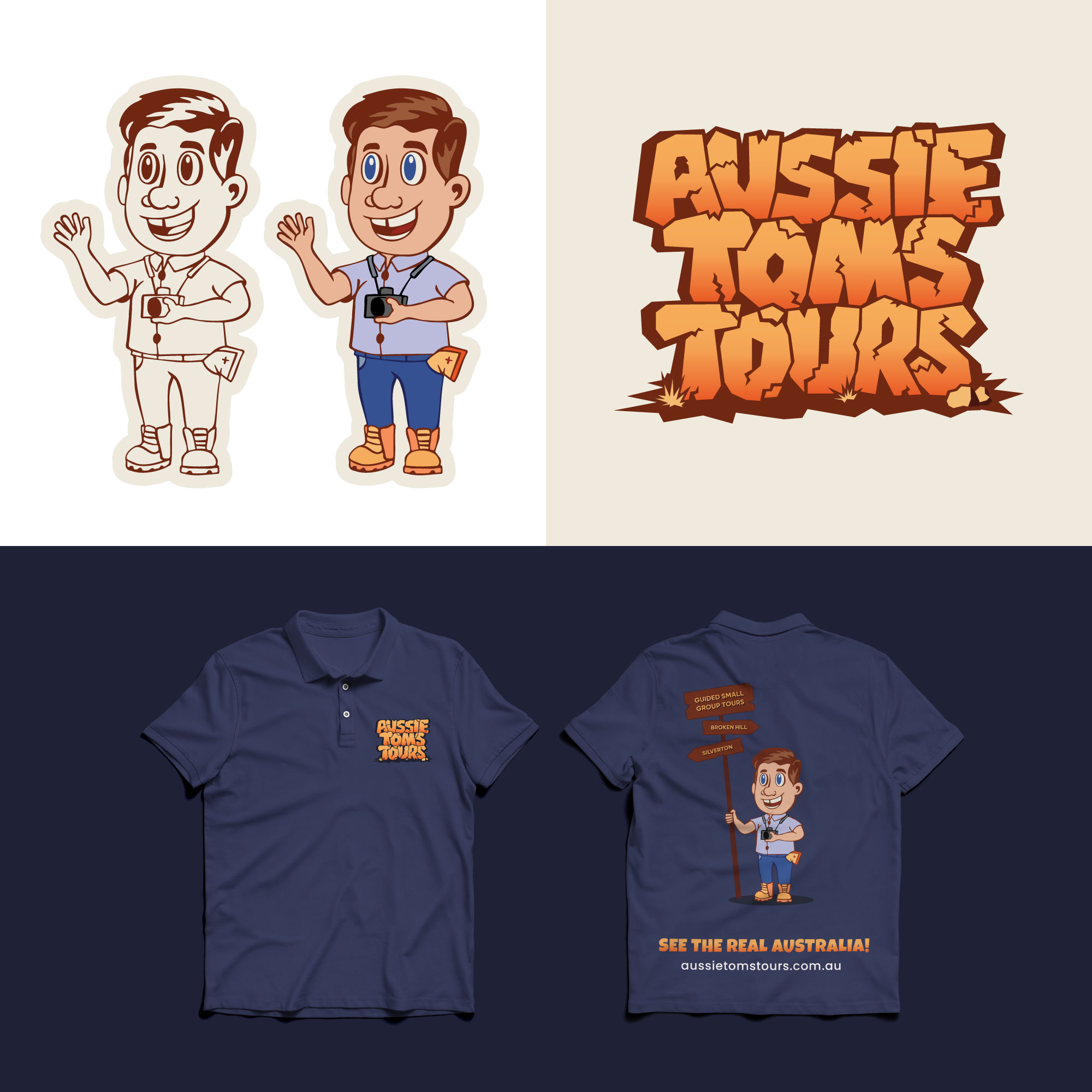
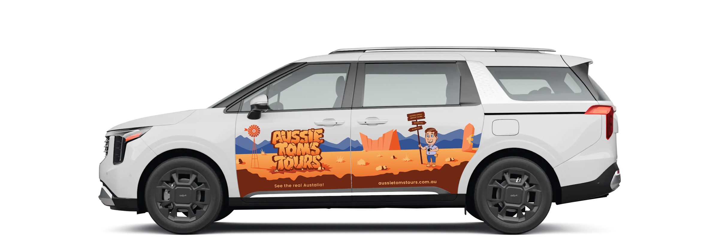
To bring the identity to life, we created a mascot inspired by Tom, the tour operator himself. His unique characteristics were carefully observed and translated into a playful, illustrative character that served as the face of the brand.

Continuing the illustrative direction, we introduced a hand-drawn signboard featuring the tour locations and the tagline “Guided Small Group Tours”. We also crafted a custom type style for the text-based logo element, inspired by stacked rock boulders as a nod to Broken Hill’s rugged terrain.

To wrap up the creative, we developed a custom landscape illustration for use across a range of brand applications. Inspired by Broken Hill’s attractions, we added illustrative elements that highlighted the region and created a flexible backdrop for the overall identity.

Logo Design for Tom's Aussie Tours

A digital gateway to the outback

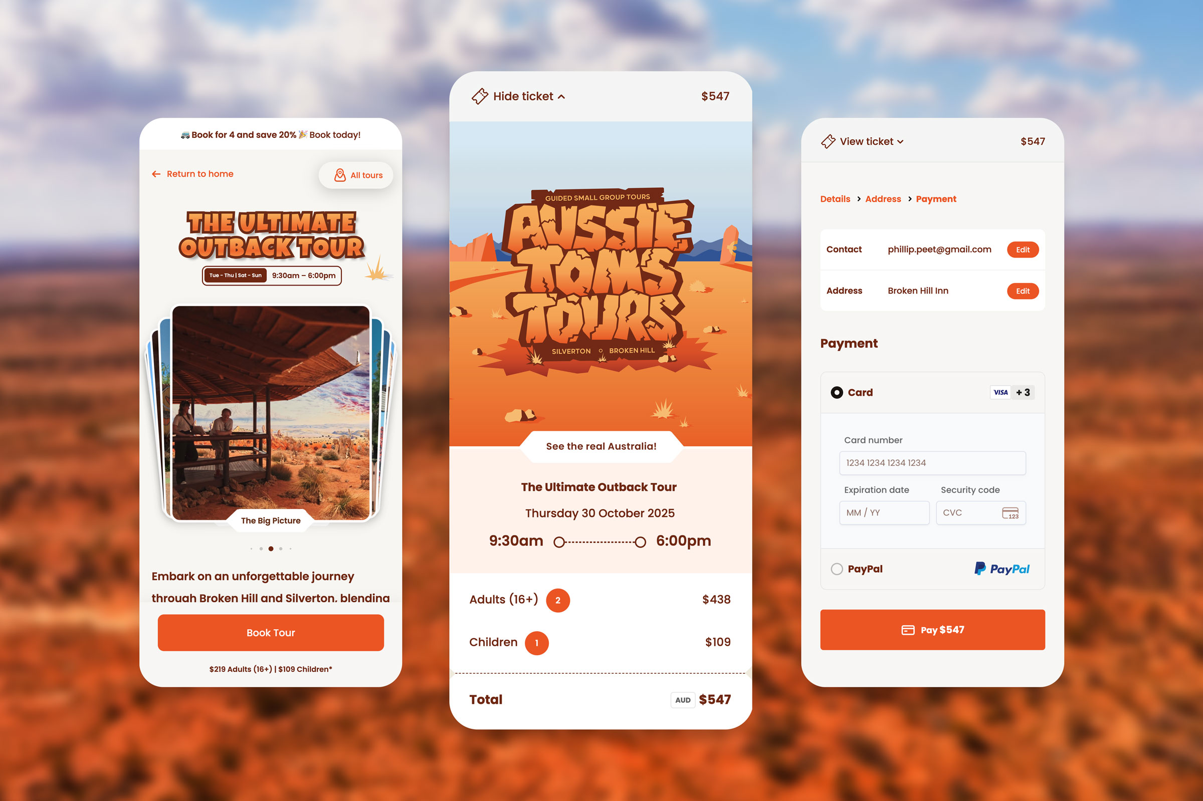
We designed the website as a responsive storytelling journey that captures the spirit of adventure. Rich visual content, illustrations, and curated itineraries immerse users from the moment they arrive, guiding them through each tour in a way that feels authentic and inviting.

This immersive approach extends through to the checkout experience, where a simplified, streamlined process makes booking tours effortless. Every touchpoint was crafted to feel consistent and engaging — from the first scroll to the final confirmation — creating a cohesive digital experience that embodies the spirit of exploration and invites users to discover, plan, and book with ease.

Aussie Tom's Tours Demo
Thomas Peet, Aussie Tom’s Tours

“Phil, it looks amazing and I think this is going to be huge. I’m really happy with how easy everything is to manage — and the feedback since launch has been incredible.”

Visit the Website

Shack Homewares

Shack Furniture Creative Branding

Immersive, image-driven design

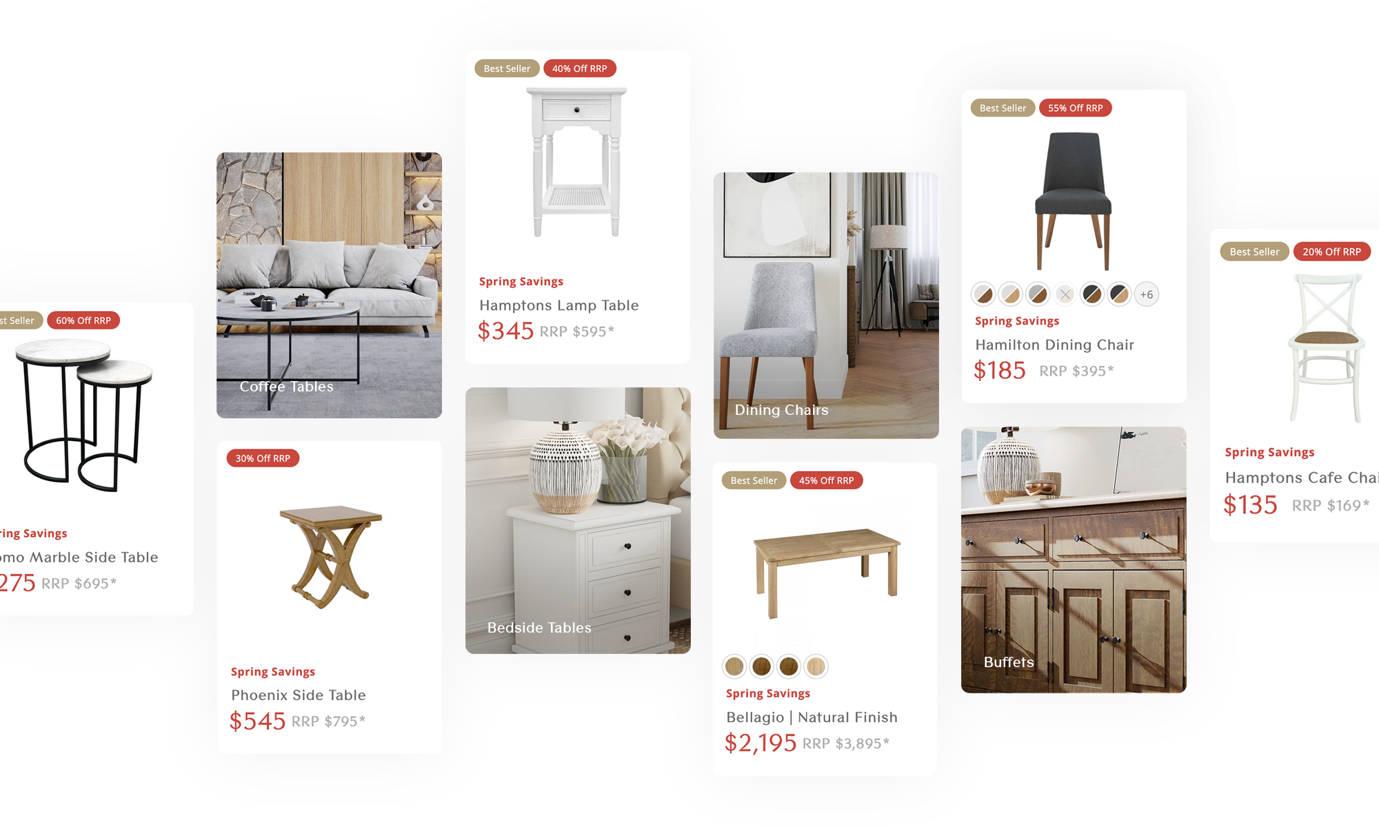
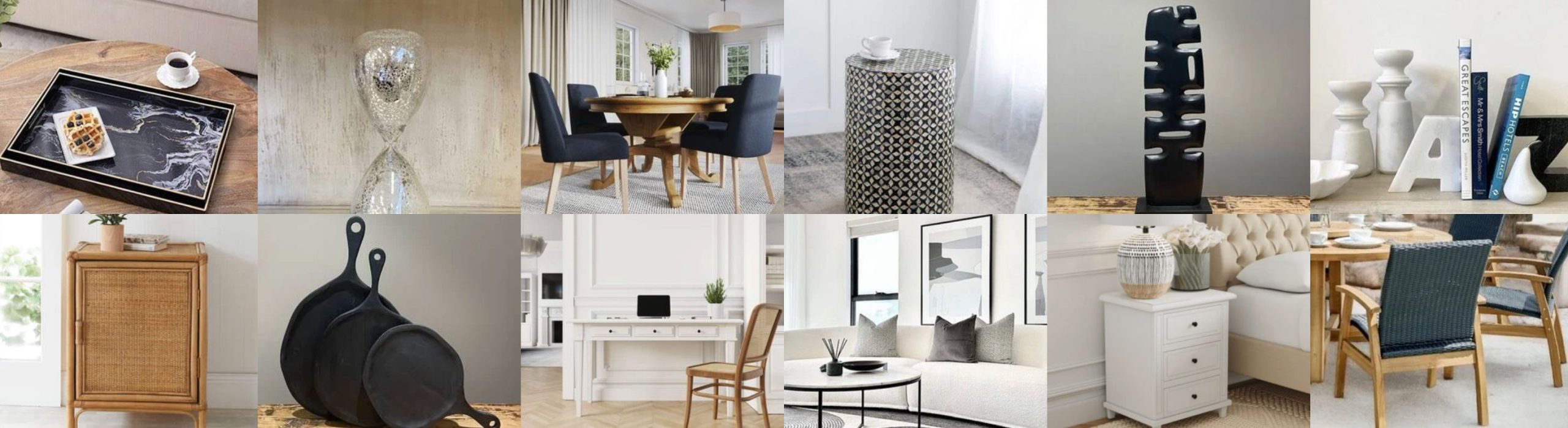
Shack’s website brings its extensive product range to life with a modular, visually rich interface. Content blocks adapt seamlessly across devices, ensuring a smooth and immersive journey on desktop, tablet, or mobile.

A grid-based design establishes a clear visual hierarchy, highlighting key promotions, best sellers, and curated collections. By balancing promotional tags, pricing cues, and lifestyle imagery, the interface guides users through the product range, encouraging exploration while boosting engagement and conversions.

Shack Furniture Brand Image

Seamless shopping experience

The user experience was designed around clarity, simplicity, and ease of navigation. A clean, uncluttered layout and neutral colour palette let the products take center stage while maintaining Shack’s refined aesthetic. An intuitive collapsible menu neatly organizes categories, sub-sections, best sellers, and in-stock items, allowing users to explore the full range effortlessly and without visual clutter.

At the heart of the shopping journey is the integrated side cart, which lets users view and edit selections, estimate shipping, apply coupons, and track totals — all without leaving the product page. This real-time, interactive tool keeps users engaged, while the streamlined multi-step AJAX checkout provides a fast, distraction-free path to purchase, reducing abandonment and ensuring a seamless, satisfying shopping experience.

Shack Homewares Demo

Supercharged eCommerce tools

The Shack website is powered by smart, interactive tools that guide users effortlessly through the product range. From instant predictive search to dynamic carousels and best-seller sliders, each feature is designed to surface the right items at the right time, offering multiple ways for users to explore and discover new items.

Intuitive predictive search

The instant, predictive search feature suggests relevant results as users type, helping them locate products quickly and effortlessly.

By anticipating queries and presenting options in real time, it reduces friction, improves discoverability, and keeps delighted engaged throughout their shopping journey.

Interactive product carousel

The swipeable product carousel on the Shack home page lets users explore curated collections by category, turning product discovery into an engaging, interactive experience.

By filtering items in real time, it highlights relevant selections and brings the brand’s range to life, while ensuring the browsing journey feels effortless and enjoyable on any device.

Lance and Julia Shofer, Shack Homewares

“We love our new website and how it has all come together. As always it is an absolute pleasure working with you.”

Visit the Website

Prestige Tiles & Co.

Branding

Looking to create a distinctive edge in a competitive marketplace, we reimagined the Prestige Tiles & Co. brand. We set out to create a simple, modern, and versatile identity.

We produced a comprehensive style guide to showcase the full application of the brand. The document defined logo variants, colour palettes, font collections, signage, digital, print, and social media application.

User experience

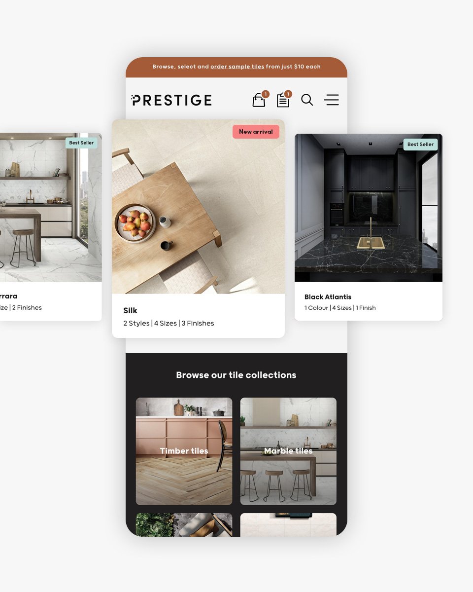
A major focus in the evolution of Prestige Tiles & Co. was to create an immersive end-to-end digital platform. One that provided the same level of satisfaction on desktop and mobile devices.

Working closely with my client, we clustered and showcased products in several ways for users to browse. We incorporated all the necessary tile information in single-touch UI elements – style, size, and finish. From this point, one can easily request a sample or quote based on their selection.

Elias Sleiman, Prestige Tiles & Co.

“The brand redesign and website upgrade have transformed the way we connect with our customers. Our new modern, minimal, and versatile identity truly reflects the quality and sophistication of our tiles. The upgraded website offers a seamless experience, making it easier than ever for our clients to explore our collections and find inspiration for their projects.”

Visit the Website

Prestige Tiles & Co. Website in Tablet

1st Street Financial

Brand revitalisation

Faced with a dated look and feel, we set out to give 1st Street Finance a distinctive edge. We started by defining a versatile set of brand colours. We then switched attention to type selection, general imagery, motion graphics, and other creative assets.

Build customer rapport

1st Street Financial is committed to providing a personalised service for its customers. We wanted to reflect this in the digital space. Therefore, we created an expansive staff section where you could view and access one’s profile. Each staff page includes a photo, bio, testimonials, and contact details.

User Interface

Taking out a mortgage can be a daunting and stressful process. With this in mind, we set out to provide a clear and informative platform. The new website is rich in content. It incorporates a curated lending section, in-depth news and insights, handy financing calculators, and a quick and easy way to reach out.

1st Street Financial Demo
Jeremy Fisher, 1st Street Financial

“Thanks heaps for all your hard work on the new website. Really happy with it!”

Visit the Website

Nerada Tea

The Objective

Working in conjunction with Mastermind Consulting the focus of this project was to deliver a platform that would reflect Nerada Tea’s authenticity and core values. We also set out to increase exposure and engagement with the brand, especially through social media channels.

The Result

Mastermind Consulting played a vital role in the initial design phase by reworking the Nerada Tea logo. Although the change was only minor – removing the rectangular background shape, it provided a far more versatile and adaptable alternative for digital devices. They also rediscovered the fonts and colour palette drawing inspiration from the plantation – something that was desperately missing from their previous website.

Using these assets we went on to design and launch a clean and aesthetically pleasing website. With noise and clutter minimised, customers are instantly immersed in curated content that tells a story of Nerada Tea’s history and products.

One of the more challenging yet creative parts of this build was the history page. This page features an interactive journey like experience where content is revealed as you scroll down the page. A somewhat similar approach was used for both the making tea and tea glossary sections.

Nerada Tea Visit Us

John Russell, Nerada Tea

“The new Nerada Tea website has brought tears to my eyes. We absolutely love it!”

Visit the Website

Emma

The Objective

Late in 2017 we were contacted and asked to help re-energise the emma website. The previous website lacked flow and direction. The audience reports were frustrating to navigate as they each loaded onto a separate page. The section to ‘apply for readership’ was difficult to locate not to mention that the form itself was rather lifeless. In turn, all these issues made for a very underwhelming user experience.

Clarity, Usability, and Management

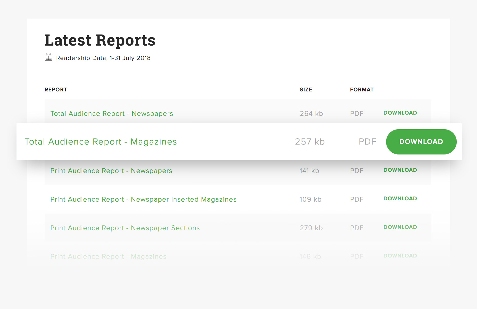
We set out to make it as easy as possible for visitors to quickly view and download audience reports. Hence the new emma website houses all monthly data sets on a single page dating back to 2013. We didn’t stop there either. Under the hood, we also made a point of making it easy for our client to manage, maintain and publish content.

A premium experience, all round.

From desktop through to mobile, every facet of this digital platform has been designed with a focus on user experience. Subtle animations and clear call to actions entice visitor engagement.

Powered by WordPress this purpose-built site offers an immeasurable capacity for growth and expansion.

Charlie Murdoch, NewsMediaWorks

“Looks grand! We are already noticing much better brand engagement. An absolute pleasure doing work with you”

Visit the Website

Gary Johns

The Strategy

For this project, creating a more corporate (less comical) presence and a website that was easy to manage was key to the outcome. Commencing work on the brand, we opted to replace the previous primary font with a modern sophisticated ‘block’ type. In turn, we also created a more agile version of the identity which purely consisted of the initials, “GJ”. These initials were intentionally offset to depict music notes and create a feeling of motion/sound.

Our client supplied us with a selection of high-quality portrait photographs which, from website (user interface) point of view, made our job much easier. We utilised these in conjunction with the new brand to deliver a visually powerful design.

The website, a custom WordPress theme, features a fixed positioned announcement ticker (at the base of the home page) that is synchronised to Gary’s Twitter account. This makes it easy for Gary to post upcoming gig times and information on both his website and social media platforms at the same time. Another key feature was the integration of parallax scrolling effects. The inclusion of parallax meant that we were able to make different sections to move at different speeds. As a result, we were furthermore able to enhance the user experience.

Gary Johns, Gary Johns

“Website looks killer and all working great. Thanks for turning this around so quickly!”

Visit the Website